
After creating a questionaire to analyise key interests and qualities of the modern day student, I have started to look at the results. So far I have had 62 responses so far.


After creating a questionaire to analyise key interests and qualities of the modern day student, I have started to look at the results. So far I have had 62 responses so far.


After deciding I wanted to work with the theme identity, I decided to pinpoint one identity in particular. Ive started to look at the student identity, what is the modern day student like? What are the common interests? How do they define themselves?
To start collecting data I asked students of different courses and ages What 4 things would you say defines you as a person? With the responses I received I categorised them into groups such as adjectives, hobbies/interests, people and appearance. From this I can see the commonalities of the modern day student this will now help me delve further into my research to enable me to visualise in data form.
In his article Infosthetics: the beauty of data visualization Andrew Vande Moere, well-known through his blog Infosthetics, discusses the aesthetics of data visualization and modern apparoaches in this area. This is symbiosis between creative design and information visualisation Form follows data and evolves in such unique graphs that you can call them art.http://pingmag.jp/2007/03/23/infosthetics-form-follows-data/
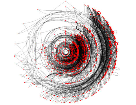
This is a piece of data visualisation that Andrew commends by Boris Müller. This is the newest ‘visual theme’ for a annual international German literature festival. 2006 the theme consisted of beautiful visualizations of the poetry texts themselves. Each word corresponded to a numerical code by adding the alphabetical values of its letters together. This number was mapped onto the position on a circle, and marked by a red dot. Gray lines connect the dots in the sequence the words appear in the poem. The diameter of the circle on which the dots are placed is decided by the length of the poem.
The Map of Science by W. Bradford Paley: “The image was constructed by sorting roughly 800,000 scientific papers (shown as white dots) into 776 different scientific paradigms (red circular nodes) based on how often the papers were cited together by authors of other papers…” Research & Node Layout: Kevin Boyack and Dick Klavans; Data: Thompson ISI; Graphics & Typography:W. Bradford Paley; Commissioned by Katy Börner.

“It is not a surprise then, that the most successful infographics use creative design insights. they positively stimulate our senses, in terms of engagement, involvement, and imagination, they are also optimized for the specific task of conveying complex data-driven concepts in intuitive and easily comprehensible ways.”
This is a quote from the essay that I find useful within my own professional practise. I need to find a way of conveying my data in a legible way.
“Evidence is evidence wether words image number or diagrams are involved wether they be still or moving the information doesn’t care the content doesn’t care it is all still information.”
The main thing I took from this data is that you “learn as you analyse”. I need to truly explore data visualisation and my data to be able to successfully convey a message, information or problem.
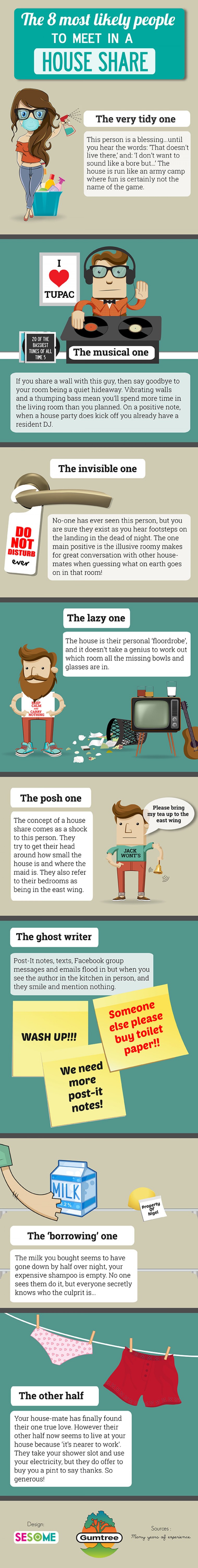
This is a humorous info graphic created titled ‘8 most likely people to meet in a house share’. This is an example of how collected data based on identity has been generated into a piece of graphic design. This is a very playful design, I like the humorous approach to data visualisation as it adds fun to design!
